The interview was conducted in English and translated into German and shortened in some places to make it easier to understand.
Why do you think design is so important in the food industry?
Design is an important tool that helps companies to market their products. In such a competitive industry, design helps to stand out from the crowd. However, design is not only important for winning over private consumers, but also business customers such as supermarkets. If you wanted to sell them chocolate that is similar in most aspects to the existing competition and also has dark brown packaging, business customers would probably show less interest, as such chocolate packaging is already widely available. When design is done competently, it appeals to customers and stays in their minds, which in turn helps the company become part of their lifestyle.
What makes KoRo design different from other companies?
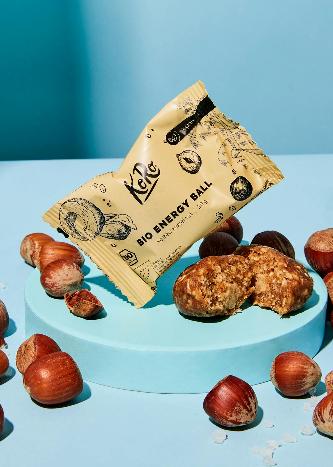
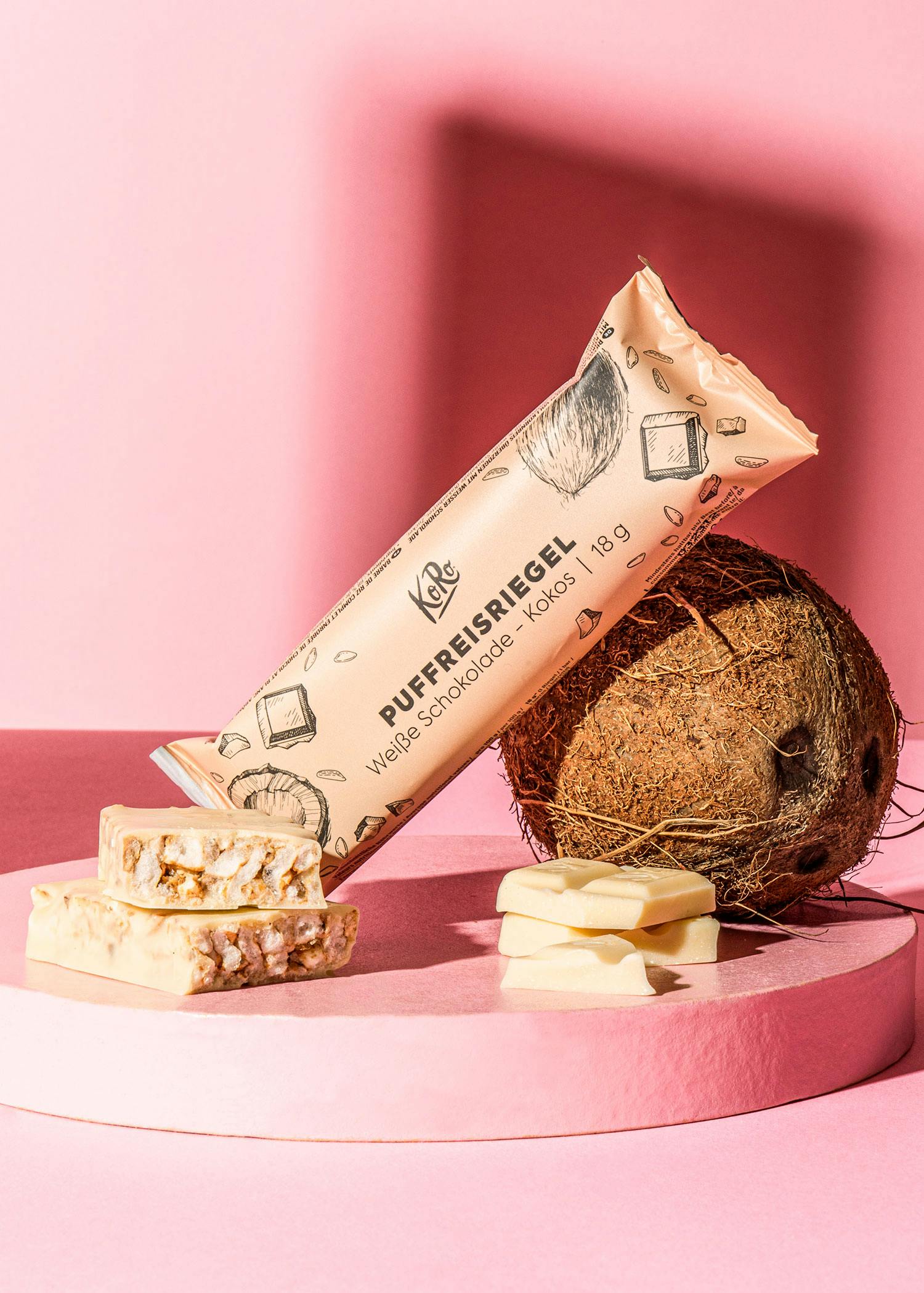
KoRo was initially only set up as an online store. This meant that the products were not forced to stand out in retail stores with a visually loud design and a greater focus on the individuality of the packaging design could be guaranteed. This led to the authentic design that we know today. Authenticity is crucial and yet a sticking point for many companies, as it is not that easy to create an authentic design. The hand-drawn design elements communicate the high level of craftsmanship with which we create our design and reflect the high quality of our food, which has always been a big factor at KoRo. The design therefore communicates a core value of KoRo in a very uncomplicated and straightforward way. In terms of design, KoRo does not try to jump on the next best bandwagon towards modernization - even the KoRo logo contains the sentimentality of something handwritten. This makes the company look very authentic in today's world.
How do you create new designs for product packaging?
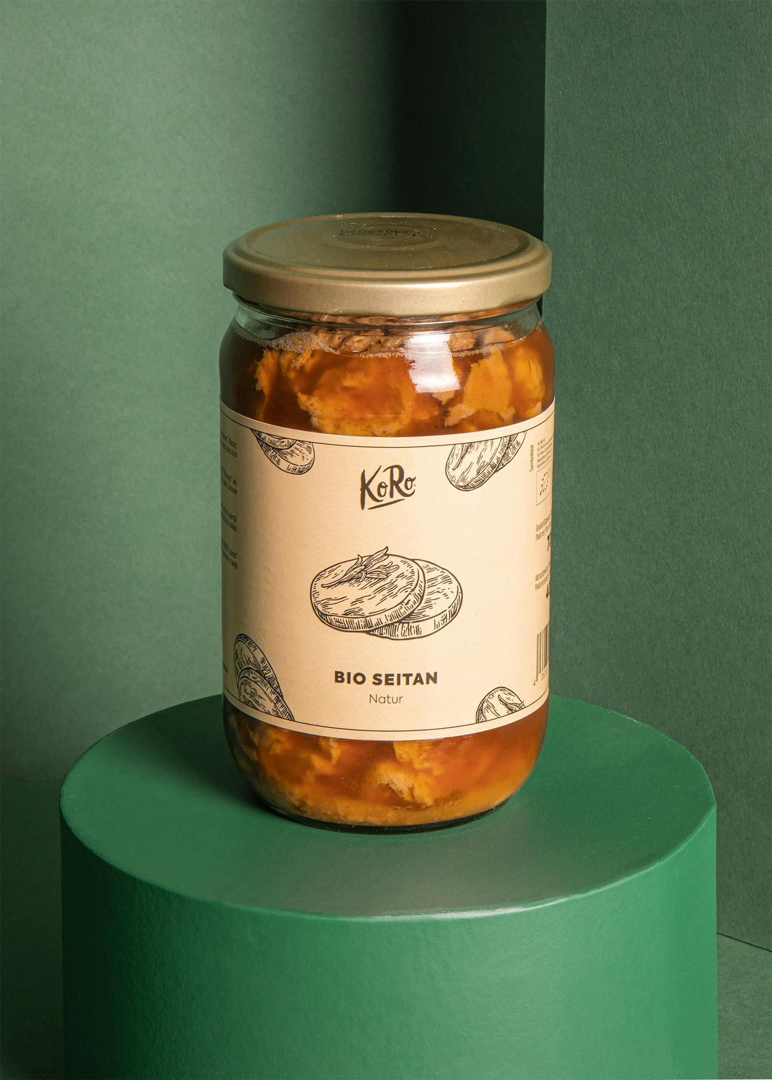
For our day-to-day business, we follow a design system, i.e. a specific template, which is constantly being improved. The biggest challenge is usually adapting the system to special packaging formats or products. With products, the question always arises as to whether a drawing of the product itself, a picture of the recommended consumption or other sensory hints should be shown. This is usually the case with products that cannot be seen through the beige packaging, but should create a clear image in the consumer's mind so that they know what product to expect. Our bars or energy balls are a classic example of this. On the other hand, there are also products that are visible through transparent packaging but still benefit from a consumption recommendation as part of the packaging design, as they can otherwise appear too abstract to the customer. This is the case with our organic seitan, for example.
What is your favorite KoRo product that you have designed?
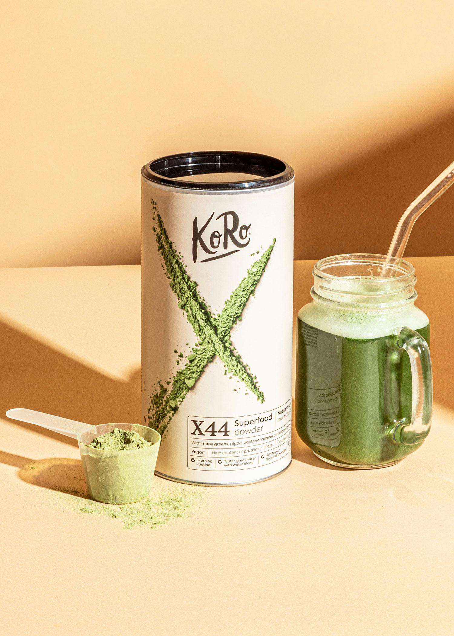
I was particularly happy with our X44 Superfood Powder as it was the first product I designed at KoRo in my first week. It's basically my first KoRo baby, so it has a special place in my heart. It's also one of the products whose design challenges the design system we've already mentioned. In this case, the experimental design supports the innovative character of the product.
Can you give us a sneak peek at what developments there will be in KoRo design in the future?
The idea behind the design of X44 was to move away from the typical KoRo design without losing KoRo's own character. Although the "handmade aspect" is part of the KoRo identity, in certain cases it doesn't communicate the diversity of our products quite as clearly. That is why we have opted for a different design here, in which the X is drawn with the help of the powder and thus still represents something handmade. We have retained the minimalist design with a beige background and black lettering. We are currently in the process of defining the KoRo core, which could lead to a different expression of KoRo's identity through design. This could lead to changes in packaging design in the long term.


